


Ad Hoc Reporting Software: 11 Best Tools (and how to choose)

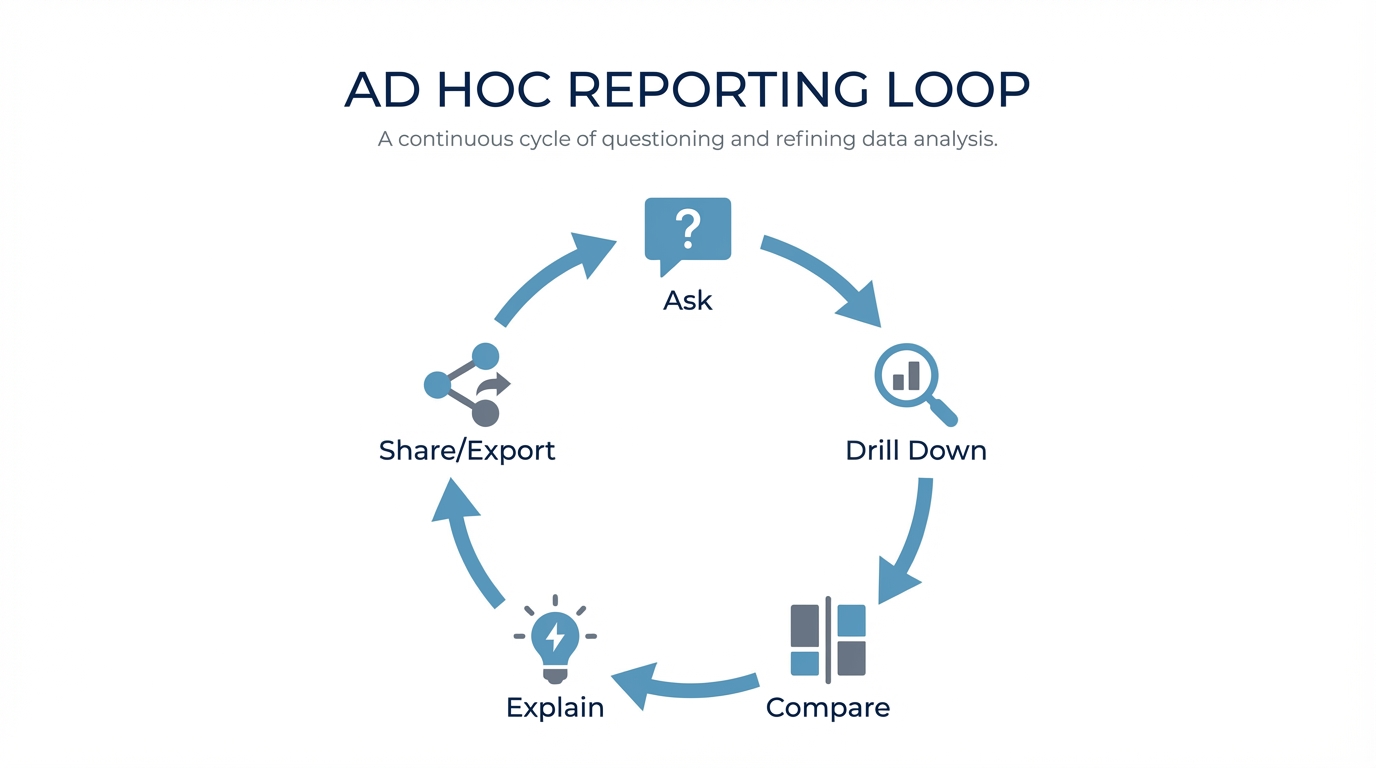
Ad hoc reporting isn’t about building a new dashboard. For most teams, it’s an iterative Q&A loop on live data:
Ask → drill down → compare → sanity-check → share/export.
The deliverable is usually a quick table, chart, or CSV dump—not a perfectly branded PDF. The best software tightens that loop without turning your analysts into human query engines or creating a graveyard of unmaintainable reports.
TL;DR
- Excel-heavy culture? If you need governed, repeatable metrics, stick to traditional BI (Power BI/Tableau) or a semantic-layer tool (Looker).
- Need non-tech self-serve? Focus on UX + governance + accuracy rather than chart variety.
- evaluating AI/Chat? Don’t trust the demo. Test it against your specific schema and messy questions.
Not sure which solution is right for your needs? Take our quick 2-minute assessment to get personalized recommendations.
What is ad hoc reporting software?
Ad hoc reporting software helps you create on-demand reports to answer specific business questions not covered by your scheduled dashboards.
The textbook definition (NetSuite) says it answers a single, specific business question, often producing a one-time report. In practice, that “one-time report” usually turns into a short exploration loop. Source: NetSuite’s definition of ad hoc reporting: https://www.netsuite.com/portal/resource/articles/data-warehouse/ad-hoc-reporting.shtml
Ad hoc reports vs. canned reports
- Canned reports: Pre-built, standardized, scheduled (e.g., the Monday morning KPI deck).
- Ad hoc reports: On-demand, question-driven, exploratory (“Why did signups dip yesterday?”).
Reporting vs. Analysis
People use these interchangeably, but there’s a nuance:
- Ad hoc reporting: Focuses on shareable outputs (tables, charts, exports).
- Ad hoc analysis: Focuses on reasoning (root cause, segmentation, "why").
Good software handles both.
Why ad hoc reporting is still painful
The market is massive—Fortune Business Insights projects self-service BI growing from $6.73B (2024) to $26.54B (2032). Source: https://www.fortunebusinessinsights.com/self-service-bi-market-107848
Yet, adoption is surprisingly flat.
- BARC reports self-service BI adoption has stalled at ~55% since 2014.
Source: https://barc.com/self-service-bi/
- Forrester notes only ~20% of users effectively self-serve, leaving 80% reliant on IT/analysts.
Source: https://www.forrester.com/blogs/bring-data-to-the-other-80-of-business-intelligence-users/
This gap creates tangible operational pain.
Pain point 1: Analysts become “human query engines”
Pain point 2: Context switching kills deep work
Pain point 3: “Self-service” creates report sprawl
The most common failure mode: everyone builds their own reports with no guardrails. You end up with thousands of dashboards, no one knows which one is accurate, and everything breaks when the data model changes.
Pain point 4: AI/NLQ hype vs. reality
Natural language is a genuine shift, but be careful. The question isn't "does it have a chat interface?" It's:
- Does it reliably map questions to your specific schema?
- How does it handle ambiguity?
- Can you teach it your definitions?
If you're unsure which category fits you, use the assessment linked at the top. It’s built for these specific trade-offs.
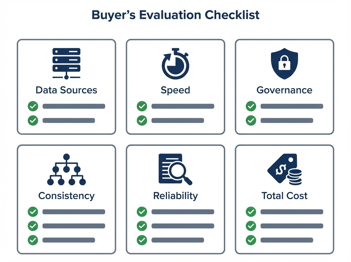
The Buyer’s Checklist: What actually matters
Every team has different constraints. Here’s how to compare tools apples-to-apples.
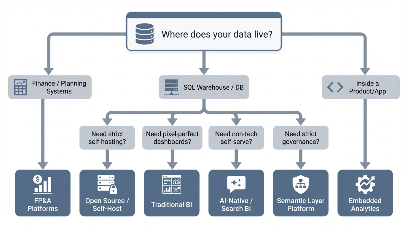
1) Data source fit
Where does the data live?
- SQL warehouses: Snowflake, BigQuery, Postgres, etc.
- SaaS silos: Analytics inside GA4 or Salesforce (often limited to that silo).
- Finance systems: FP&A tools are a separate beast.
If it doesn’t connect to your source of truth, nothing else matters.
2) Speed (Iteration > Rendering)
Ad hoc work is messy.
- Can you ask fast follow-ups (“now break by region”, “compare to last week”)?
- Is the export to CSV/Excel immediate?
3) Governance & Auditability
You need to know who changed what. Look for:
- Role-based permissions (down to the column level).
- Query history logs.
- Workspace sharing controls.
- Prevention of "metric drift" (e.g., preventing three different definitions of "active user").
4) Semantic consistency
Where do your metric definitions live?
- Semantic layer: Strong consistency, heavy setup (Looker style).
- Curated datasets: Consistent, but less flexible.
- AI + Context: Fast self-serve, provided you manage the training/context well.
5) Handling "Gotchas"
Ad hoc reporting breaks on the boring stuff. Test for:
- Multiple date columns (created_at vs. paid_at).
- Revenue definitions (net vs. gross, refunds, credits).
- Fiscal calendars and time zones.
6) Total cost of ownership
The license fee is the visible cost. The real cost is:
- Analyst hours spent on repetitive tickets.
- Rework caused by bad data.
- Maintenance of broken dashboards.
Quick comparison: 11 tools at a glance
Pricing is indicative and changes often. Verify with vendors.
| Tool | Best for | Ad hoc UX | Governance | The Trade-off | Pricing signal (starting) |
|---|---|---|---|---|---|
| Power BI | Microsoft shops, cost-sensitive rollouts | Medium | Strong | Steep learning curve (DAX) | ~$14/user/mo (Pro) |
| Tableau | Visual exploration | High | Strong | Costs scale fast; heavy admin | ~$15/user/mo (varies) |
| BlazeSQL | Natural-language on SQL data | High | Strong | Less “pixel-perfect” than legacy BI | Seat-based; predictable |
| Looker | Governance via semantic layer | Medium | Strong | Heavy LookML setup; slower iteration | Quote-based |
| ThoughtSpot | Search-style analytics | Medium | Strong | Requires pristine modeling | ~$25/user/mo (Essentials) |
| Sigma | Spreadsheet interface on cloud data | High | Strong | Enterprise pricing | Quote-based |
| Metabase | Simple self-serve + OSS | Medium | Medium | Less polish at scale | Free OSS / paid cloud |
| Apache Superset | OSS dashboards + SQL | Medium | Medium | You maintain it (engineering heavy) | Free OSS / managed |
| Domo | “All-in-one” platform | Medium | Strong | Unpredictable costs | Quote-based |
| Sisense | Embedded analytics | Medium | Strong | Implementation complexity | Quote-based |
| Prophix | FP&A / Finance analysis | Medium | Strong | Niche focus (Finance only) | Quote-based |
Best ad hoc reporting software (11 tools reviewed)
Traditional BI Platforms
Power BI
The default choice for Microsoft-heavy organizations. It offers the full suite: dashboards, sharing, and governance.
Why teams choose it
- Cheap entry point for broad rollouts.
- Mature governance.
- Massive community support.
The Trade-off
- Ad hoc requests often boomerang back to analysts because DAX/modeling is hard for business users.
- Licensing gets confusing at scale.
Best for: Microsoft shops with a BI “center of excellence.”
Tableau
Famous for visual exploration. It shines when you have trained analysts who can build interactive views quickly.
Why teams choose it
- Best-in-class interactive exploration.
- Visual storytelling is superior.
The Trade-off
- Expensive at scale.
- True self-serve is rare; usually requires skilled builders to set up the views first.
Best for: Teams where visual quality is the priority and budget is flexible.
AI-native & Search-based Analytics
BlazeSQL
AI-native BI that queries SQL databases via natural language. You get the SQL, the table, and the chart—then you iterate.
Why teams choose it
- Fits the ad hoc loop perfectly: Ask → Drill → Compare → Export.
- Captures business context (definitions, rules) to improve reliability over time.
The Trade-off
- If you need pixel-perfect, heavily branded reports, stick to legacy BI.
Best for: Fast self-serve on SQL data—especially for non-technical teams who need answers now.
ThoughtSpot
The pioneer of search-driven analytics. Great for broad self-serve if the underlying data is clean.
Why teams choose it
- Search UX feels fast for simple questions.
- Strong enterprise features.
The Trade-off
- “Search” only works if your data modeling is impeccable.
- Can be pricey compared to simpler tools.
Best for: Large orgs investing in governed self-serve with strong data modeling resources.
Governed Semantic Layer Platforms
Looker
The gold standard for "metric chaos." You define metrics once in LookML, and they apply everywhere.
Why teams choose it
- Unmatched consistency and governance.
- Single source of truth for KPIs.
The Trade-off
- Requires specialized skills (LookML) to set up and maintain.
- Ad hoc flexibility is limited to what has been explicitly modeled.
Best for: Orgs prioritizing strict governance over free-form exploration.
Modern Cloud Data Warehouse BI
Sigma
Spreadsheet-style interaction directly on your cloud warehouse (Snowflake/BigQuery).
Why teams choose it
- The spreadsheet interface is familiar to business users.
- Live data connection (no extracts).
The Trade-off
- Often priced for enterprise/mid-market.
- Still requires governance to prevent "spreadsheet chaos" in the cloud.
Best for: Warehouse-first orgs wanting Excel-like flexibility at scale.
Open Source / Self-Hostable Options
Metabase
Simple, approachable, and optionally self-hosted.
Why teams choose it
- fast setup; easy UI.
- Great for internal dashboards and basic exploration.
The Trade-off
- Enterprise governance features are weaker than the big players.
- Complex queries still require SQL knowledge.
Best for: Small-to-mid teams needing lightweight self-serve.
Apache Superset
The engineering-led choice. Open-source, flexible, and SQL-heavy.
Why teams choose it
- OSS flexibility.
- Connects to almost anything via SQL.
The Trade-off
- You own the reliability/upgrades (high operational overhead).
- UI isn't as polished for non-technical users.
Best for: Engineering-heavy orgs with the bandwidth to maintain their own tools.
“All-in-One” BI Suites & Embedded Analytics
Domo
Positions itself as the platform for everything—connectors, storage, ETL, and visualization.
Why teams choose it
- Broad capabilities in one box.
- Strong sharing and mobile workflows.
The Trade-off
- Cost is hard to predict.
- Some teams prefer a modular stack (Warehouse + BI) over an all-in-one silo.
Best for: Orgs wanting a single platform for all operational reporting.
Sisense
Often the go-to for embedded analytics (analytics inside your product).
Why teams choose it
- Strong embedding capabilities.
- Good for customer-facing reporting.
The Trade-off
- Heavy implementation effort.
- Self-serve depends entirely on how well you model and expose the data.
Best for: Product teams building analytics for their customers.
Prophix
Focused on FP&A, budgeting, and financial planning.
Why teams choose it
- Built specifically for finance workflows.
- Better than generic BI for financial modeling.
The Trade-off
- Not a general-purpose tool for the rest of the company.
Best for: Finance teams needing ad hoc analysis within a planning context.
How to choose (without overthinking it)
Don't boil the ocean. Use these anchors to decide:
- Need answers for non-technical teams? Prioritize frictionless UX and strong guardrails. If they need training, they won't use it.
- Priority is "One Single Version of the Truth"? Prioritize semantic modeling (Looker) or strict governed datasets.
- Need strict infrastructure control? Look at open source (Superset/Metabase)—but be honest about your team's capacity to maintain it.
- Building for your customers (Embedded)? Prioritize multi-tenancy and embedding APIs (Sisense).
Still stuck? The assessment link at the top is the fastest way to get a specific recommendation.
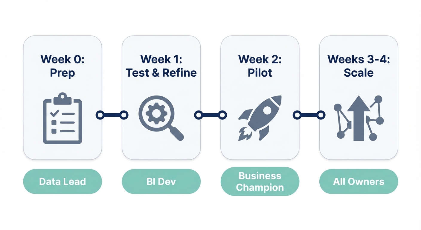
Implementation: A 4-week rollout that actually works
Most BI projects fail because of scope creep. Dataversity notes that 60% of BI initiatives fail to deliver value. Source: https://www.dataversity.net/articles/why-60-of-bi-initiatives-fail-and-how-enterprises-can-avoid-it/
Here is a rollout pattern that avoids the graveyard of unused dashboards.
Week 0: Prep
- Confirm the source of truth.
- Document 10–20 questions people actually ask.
- Set initial governance (who sees what?).
Week 1: Break it
- Run those 10–20 questions end-to-end.
- See what breaks (definitions, joins, dates).
- Add context to fix the gaps. Do not write a massive data dictionary first; fix as you go.
Week 2: Pilot
- Invite one functional team (e.g., Marketing).
- Keep access read-only if possible.
- Review their outputs manually to build trust.
Weeks 3–4: Expand & Standardize
- Expand to the next domain.
- When a question gets asked 5 times, promote it to a saved query or dashboard.
- Set a lightweight review cadence.
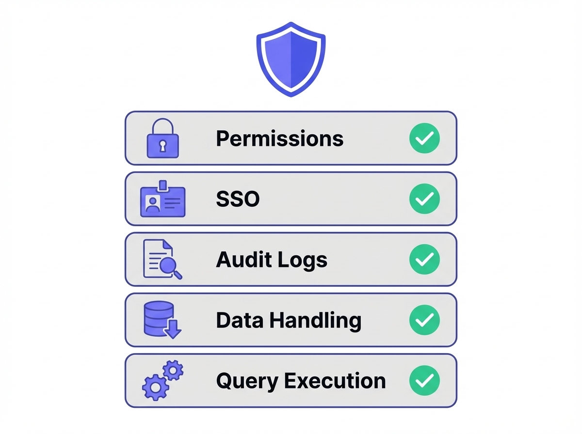
Security & Governance: The Demo Checklist
Ask the vendor to show you these features using your data:
- Permissions: Can I restrict access by table and column?
- SSO: Do you support SAML/SCIM?
- Auditability: Can I see exactly who queried what and when?
- Data Handling: What do you store? (Queries, results, schemas?)
- Execution: Do queries run directly or via a controlled connector?
FAQ: Ad hoc reporting
What is an ad hoc report?
A report created on-demand to answer a specific, usually one-off question, outside of the standard scheduled reporting cycle.
What are the downsides?
- Analyst burnout: It turns data teams into ticket-takers.
- Inconsistency: Without governance, you get "two versions of revenue."
- Sprawl: Thousands of reports that no one maintains.
How do you create one?
- Define the question.
- Identify the data source.
- Query/filter the data.
- Validate edge cases (dates, exclusions).
- Share the output (and save it if it’s likely to recur).
Ad hoc reporting vs. Self-service BI?
Ad hoc reporting is the activity (answering a specific question). Self-service BI is the model (business users doing it themselves). You can have ad hoc reporting without self-serve (analysts doing the work), but most teams aim for self-serve ad hoc.
Why we built BlazeSQL for this
We saw too many teams buying expensive software only to keep sending "Can you pull this data?" Slack messages to analysts.
BlazeSQL is designed for the reality of ad hoc work: Ask in plain English, get the SQL + Data + Chart, and iterate.
The secret sauce isn't just "AI"—it's context. Reliability comes from handling your specific definitions ("active user," "net revenue," exclusions). We built workflows to capture that context easily, so the system gets smarter the more you use it, rather than drifting into chaos.
If you want to test ad hoc reporting on your own database, grab a trial, connect a read-only user, and ask your hardest questions.
I was hired as a data scientist but spend 80% of my time writing SQL queries for stakeholders. This isn't data science, it's just being a human query engine.
View on Reddit